We are thinking along the same lines.nastynate wrote:A┼L
What about something simple, just A┼L in a circle, (makes easy buttons). That's an inverted cross of course...
Atlanta patches
Moderators: Brian, Metalfreak, MS_39455, AtlantaMetal Staff
-
Knucklehead
- Member
- Posts: 3808
- Joined: Sat August 26th, 2006, 5:06 pm
- Location: Decatur
-
Thrashmania
- Member
- Posts: 1250
- Joined: Mon April 29th, 2013, 7:16 pm
-
Knucklehead
- Member
- Posts: 3808
- Joined: Sat August 26th, 2006, 5:06 pm
- Location: Decatur
-
SadisticRitual
- Member
- Posts: 838
- Joined: Thu July 29th, 2010, 8:00 am
- Location: Atl
-
Gorgorostrich
- Member
- Posts: 91
- Joined: Mon January 14th, 2013, 5:37 pm
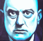
It's former GA governor and current goat zombie Lester Maddox.Moloc wrote:Who is this a drawing of? I like it. I also like the other idea with just A[inverted cross]L.Gorgorostrich wrote:I'm feeling creative.sleyja wrote:I say we take submissions and pick a wiener.

I think the suggestions for something simple and recognizable may be the more effective idea, though.
-
badcarburetor
- Member
- Posts: 2145
- Joined: Mon March 23rd, 2009, 9:12 pm
- Location: ATL
-
MikeIllustrated
- Member
- Posts: 26
- Joined: Fri September 28th, 2012, 2:59 pm

-
Knucklehead
- Member
- Posts: 3808
- Joined: Sat August 26th, 2006, 5:06 pm
- Location: Decatur
-
DeathfareDevil
- Member
- Posts: 589
- Joined: Tue December 14th, 2004, 6:24 am
- Location: East Jesus
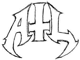
This is a good idea, and I like the example above, but is there a way to screw with the perspective to make the cross look more like a "t"? Like ... raising it up in relation to the other two letters, and maybe gathering the tops of all the letters together so that they all appear to be radiating downward from a central point? Sort of a ... triangular logo?
If I had the least bit of artistic talent I'd supply a visual aid, but I feel such a display would be more harmful than helpful.
I flailed around in paint.net (with MikeIll's letters) to see for myself what it might look like, and all I seemed to do was create a satanic logo for someone named Al. Maybe you could sell the design to Ministry.
-
MikeIllustrated
- Member
- Posts: 26
- Joined: Fri September 28th, 2012, 2:59 pm
Yeah. Wasn't really thinking about that I was just fucking around.Knucklehead wrote:Likey. A little blocky for a round patch, though, no?
I think I get what you mean. I'll give it a shot this weekend when I am wasting my life on a plane.DeathfareDevil wrote:This is a good idea, and I like the example above, but is there a way to screw with the perspective to make the cross look more like a "t"? Like ... raising it up in relation to the other two letters, and maybe gathering the tops of all the letters together so that they all appear to be radiating downward from a central point? Sort of a ... triangular logo?
If I had the least bit of artistic talent I'd supply a visual aid, but I feel such a display would be more harmful than helpful.
I flailed around in paint.net (with MikeIll's letters) to see for myself what it might look like, and all I seemed to do was create a satanic logo for someone named Al. Maybe you could sell the design to Ministry.
Maybe something like this? Obviously cleaned up and nice and symmetrical but you get the idea. Could also add drippy gore between letters if everyones into it.
<a href="http://spewtilator.bandcamp.com">SPEWTILATOR</a> - Badass motherfuckin' street cops with nothing to lose who don't play by the rules and are out for blood.
Tricalibur wrote:I am looking for Skullcrusher and Dynamo.
-
DeathfareDevil
- Member
- Posts: 589
- Joined: Tue December 14th, 2004, 6:24 am
- Location: East Jesus
Oh hells yes, that's spiffy, and you took care of the problem I noticed after my last post: A and L are the least symmetrical letters to begin and end a logo with.
Now we just have to fit ~The City Too Busy to Hate~ onto there. And maybe the image of a boiling radiator to signify our swiftly moving highway traffic.
Or yeah drippy gore and cobwebs and tombstones.
Now we just have to fit ~The City Too Busy to Hate~ onto there. And maybe the image of a boiling radiator to signify our swiftly moving highway traffic.
Or yeah drippy gore and cobwebs and tombstones.
-
Gorgorostrich
- Member
- Posts: 91
- Joined: Mon January 14th, 2013, 5:37 pm
wearin an inverted cross these days is about as menacing as rockin the golden arches...
http://chipsandbeermag.tumblr.com/Brian wrote:dance, monkey, dance!!
Who is online
Users browsing this forum: No registered users and 12 guests